14 Websites
14.1 Overview
Quarto websites are a special type of Quarto project for building…well, websites. By adding a single configuration file, you can turn any collection of Quarto documents into a website. Quarto websites are a great way to showcase your work, build documentation, or share your learning progress.
In this chapter, you’ll start with the minimal building blocks for a functional website — it takes just two files!
Then, you’ll dive into the three big components of a website:
Content: In Section 14.4 you’ll learn how pages in a website are built from Quarto documents in a project, how to cross-link pages, and to control what does and doesn’t end up on your site. Later, you’ll also learn about two special kinds of pages About pages in Section 14.7 and Listings in Section 14.8.
Navigation: In Section 14.5 you’ll learn about adding site navigation, so your viewers can easily locate content on your site.
Appearance: In Section 14.6 you’ll learn how to customize the appearance of your site by controlling colors, fonts and more.
Finally, in Section 14.9 you’ll learn how to get your website out in the world, and in Section 14.10 tools for automating the publishing process.
14.2 Minimal website
A website is just a collection of HTML pages, usually sharing some common elements like navigation or theming. In Quarto, a website project is a collection of Quarto documents targeting the HTML format, along with some website configuration in _quarto.yml.
The simplest Quarto project that results in a website consists of a directory with two files:
index.qmd(or.mdor.ipynb) that renders toindex.html—the homepage. For illustration, we’ll use a simple file with atitleand some placeholder text:index.qmd
---
title: Home
---

{{< lipsum 1 >}}
A
_quarto.ymlfile that contains:_quarto.yml
project:
  type: website
The specification of type: website in _quarto.yml means when you render the project, Quarto identifies it as a website, renders all the Quarto documents in the project, inserts the relevant website scaffolding and puts the resulting files in a _site/ directory.
The resulting _site/ directory is a completely self-contained description of the website.
Figure 14.1 shows the contents of the _site/ directory for a minimal website. It contains the rendered .html files, in this case only index.html, along with other required resources. The folders in _site/site_libs contain scripts and other source files for some of Quarto’s website tools and can be shared by all pages in the website.
_site/
├── index.html
├── search.json
└── site_libs
    ├── bootstrap
    ├── clipboard
    ├── quarto-html
    ├── quarto-nav
└── quarto-search_site/ for a minimal Quarto website
To view your website, you need a webserver to serve up the contents of this directory. This could be a local webserver like the one used for quarto preview, or a remote one like those provided by Posit Connect Cloud or GitHub Pages.
You can turn any folder into a Quarto website by adding _quarto.yml, but if you are starting from scratch you can make use of the quarto create command. On the terminal, run:
quarto create project websiteFollow the prompts to create a new website project using Quarto’s built-in template.
14.3 Workflow
Working on a Quarto website is mostly like working on a single Quarto document. You make edits to your Quarto document, now a “page” in your website, then preview to examine the result. You make more edits, then you re-run preview.
There are a couple of differences to be aware of:
Since your page may contain some elements that depend on other pages (e.g. navigation items), you may see other pages being rendered to generate your preview.
Some changes to
_quarto.ymlwon’t propagate to an already runningpreviewsession. For instance, when you add items to navigation, you may need to stop the current preview, and restart another preview to see the changes you’ve made.
It’s also important to use quarto preview (either via the Render/Preview button in your IDE or on the command line) rather than opening a generated .html file directly in your browser. A file opened directly in your browser will use the file:// protocol, rather than the http:// protocol, and some features of Quarto websites may not work, i.e. search.
14.4 Website Structure
In this section, you will learn how your project structure translates to your website structure. You’ll start by understanding how the location of your files in your project translates to the location of your pages in your site. Then you’ll learn how to link to other pages and use anchors to link to sections, figures, and other elements. Finally, you’ll see a couple of options for excluding documents from your site or to redirect to them from different URL paths.
14.4.1 File structure translates to URL structure
The structure of your files in your project directly translates to their structure in site/, and consequently, to where your pages will be available on your website.
Consider the website project in Figure 14.2. The project root is my-website/: the top-level directory, defined by the presence of _quarto.yml. To the right of each file, you’ll see the URL at which the file will be available.
my-website/
├── _quarto.yml
├── index.qmd             { base }
├── about.qmd             { base }/about.html
├── reports/
|    ├── index.qmd        { base }/reports
|    └── last-month.qmd   { base }/reports/last-month.html
└── data/
└── sales.csv { base }/data/sales.csv We use the placeholder { base } to represent the base URL of your website. When you are previewing locally that will be something like http://localhost:3884, where the number 3884 may be something else. When you publish your website, the base URL will depend on where you host it. For GitHub Pages it might look something like https://username.github.io/repository-name, and on Posit Connect Cloud something like https://username-project.share.connect.posit.cloud, or you might even have a custom domain https://yourdomain.com.
Consider the file about.qmd at the top level of your website project. It will be available at about.html at the top level of your website. If you place last-month.qmd inside a reports/ folder in your website project, it will available at reports/last-month.html on your website.
Index files are special — the index.qmd in any directory becomes the landing page for that directory. So, for example reports/index.qmd defines the page seen by someone navigating to { base }/reports or { base }/reports/.
Files don’t have to be Quarto documents. The CSV file data/sales.csv will be available at { base }/data/sales.csv. However, only rendered Quarto documents or files that Quarto deems to be necessary are copied into _site/. This means the presence of data/sales.csv isn’t enough for it to be included in the website. It either needs to be referenced in a way Quarto will detect, e.g., linked to from another page (see Section 14.4.2), or be included in the site resources (see Section 14.4.6).
Later in this section you’ll learn two ways to disrupt this direct correspondence between project paths and URL paths. You’ll see how to:
Exclude or ignore project files, so they aren’t part of the website.
Provide alias URLs, so that visitors are redirected from a URL to a document at a different path.
14.4.2 Links
A key feature of webpages is the interlinking of pages. Table 14.1 summarizes what you’ll learn in this section—how to make in-text links. You’ll learn how to add navigation links, another key kind of link, in Section 14.5.
| Type | Syntax | Result |
|---|---|---|
| Relative link to another page | [About](about.qmd) |
A link to about.qmd in the same directory |
| Absolute link to another page | [About](/about.qmd) |
A link to about.qmd in the project root |
| Link to a section on this page | [Data](#data) |
A link to the anchor #data on the current page |
| Link to a section on another page | [Contact Me](/about.qmd#contact) |
A link to the anchor #contact on the about.qmd page in the project root |
| External link | [Quarto](http://quarto.org) |
A link to the website http://quarto.org |
| Link with attributes | [Quarto](http://quarto.org){.external target="_blank"} |
A link to the website quarto.org with the class .external that opens in a new window or tab. |
| Cross-References (only within pages) | @fig-dist |
A link to the figure, along with a preview on hover. |
14.4.2.1 Linking to pages
You create a link using the usual markdown syntax, but you can refer to other Quarto documents in your website project. For example, from index.qmd you might link to the page about.qmd:
index.qmd
[About](about.qmd)This is an example of a relative link—it uses the path relevant to the document in which it is located. In this case, the result is a link to about.html located at the same level in _site/ as index.html.
Notice that the link used the extension .qmd. Quarto handles the translation so that the link in the rendered index.html will point correctly at about.html. One advantage of using .qmd is that Quarto will complain if it can’t find the document at the path you specified.
In addition to relative links you can use absolute links. Absolute links start with slash (/) and are relative to the project root. It’s particularly important to use absolute links in content that may be reused via an include shortcode at various levels in your site.
14.4.2.2 Linking to sections or IDs
You can link to a specific location within a page using the fragment identifier, a hash (#) followed by an identifier. In Quarto, all section headers are given identifiers automatically which makes it easy to link directly to a section.
As example, you could link to the “Data” section using the link #data:
index.qmd
## Introduction

See [Data](#data)

## Data
Quarto will generate an identifier by converting to lower case and replacing spaces with dashes (-), then adding a numeral it the anchor would otherwise be non-unique. Rather than remember the rules, it can be easier to specify your own. Place your identifier prefaced by # in curly braces after the section title:
index.qmd
## Introduction {#intro}

See [Data](#data)

## Data

Back in the [introduction](#intro)
You can link to identifiers on other pages, too, by adding them to the document path. For instance, to link to the Introduction section in index.qmd from about.qmd:
about.qmd
Read more in our [Introduction](index.qmd#intro)There are a lot of elements beyond sections that get identifiers automatically in Quarto. You can find the identifier of an element by looking for an id in the element in the rendered HTML (usually using something like your web browser development tools). Or, you can provide your own. For example, for any element created with a fenced div, add an identifier to the curly braces:
:::{#my-callout .callout-tip}

Here's a callout I can link to with `#my-callout`.

:::
Or for elements that are created inline add a anchor in the curly braces following the element. For example, to an image:
{#my-figure}You might recognize that this is very similar to adding a cross-reference, except we didn’t start the identifier with one of the recognized cross-reference prefixes.
14.4.2.3 External Links
To link to external websites, use the full URL, including the .html extension and fragment if applicable:
[Quarto website links](https://quarto.org/docs/websites/#linking)You can add the class .external to give a visual indication that a link will leave your site:
[Quarto website links](https://quarto.org/docs/websites/#linking){.external}You can additionally supply other attributes to include in the link in the curly braces. For example you might add target="_blank" to open the link in a new tab or window:
[Quarto website links](https://quarto.org/docs/websites/#linking){.external target="_blank"}You can learn more about external links in the Quarto documentation.
14.4.3 Cross-references
Cross-references will work within pages in a Quarto website, but will not work across pages. That is, you cannot reference with the @ syntax an element defined in a different document.
To link to a cross-reference on another page, you could use a link:
Recall from the [histogram of the data](explore.qmd#fig-dist)...If you must have across page cross-references, consider using a book project instead.
14.4.4 Aliases
Aliases are alternative URLs that point to the same page. Typically, you use aliases when you move content so that is it still available from an old URL.
For example, if you move a page from /blog/first-post.qmd to /blog/first-post/index.qmd, you can set up an alias so visitors using the old URL are automatically redirected to the new location:
/blog/first-post/index.qmd
---
title: My Post
aliases:
  - /blog/first-post.html
---
14.4.5 Excluding content from your website
The easiest way to exclude a file from your website is to name it with an underscore, or place it in a folder that starts with an _. For instance, if you are keeping a list of to do in todo.md you don’t want them rendered as part of your website, you could put them in a _notes/ folder:
my-website/
├── _notes
|   └── todo.md
└── index.qmd
An alternative approach is to use the project option render which specifies the files that should be rendered. The render option takes a sequence of files you do want to render:
_quarto.yml
project:
  type: website
  render:
    - index.qmd
To exclude files, start by specifying everything you want to render, then ignore the ones you want to exclude using the !:
_quarto.yml
project:
  type: website
  render:
    - "*.qmd"
    - "!ignore-dir/"
    - "!ignore-doc.qmd"
14.4.6 Including content in your website
When you reference a file in your content (like including an image or linking to a document), Quarto will copy the file to _site/.
But, if Quarto fails to detect your file, or you want to include a file you don’t reference can explicitly include files using the resources project option. For example, you could include all Excel (.xlsx):
project:
  type: website
  resources:
    - "*.xlsx"
14.5 Navigation
The primary navigation in a Quarto website is provided by a top or side navigation bar. Figure 14.3 gives an example of each with a single navigation link to the page generated by the file about.qmd. Both top and side navigation include the website title, “My website”, which links to index.html, then a link to about.html, where the text for the link comes from the metadata of the about.qmd page.
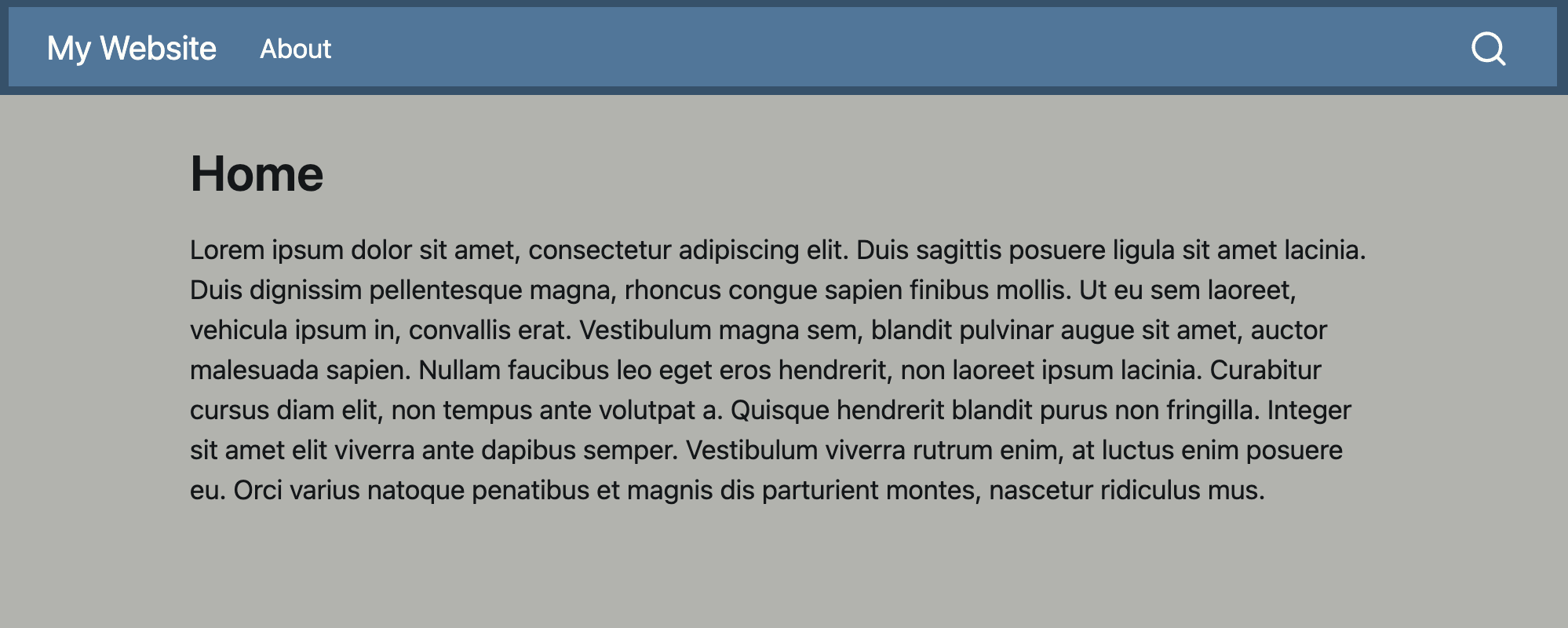
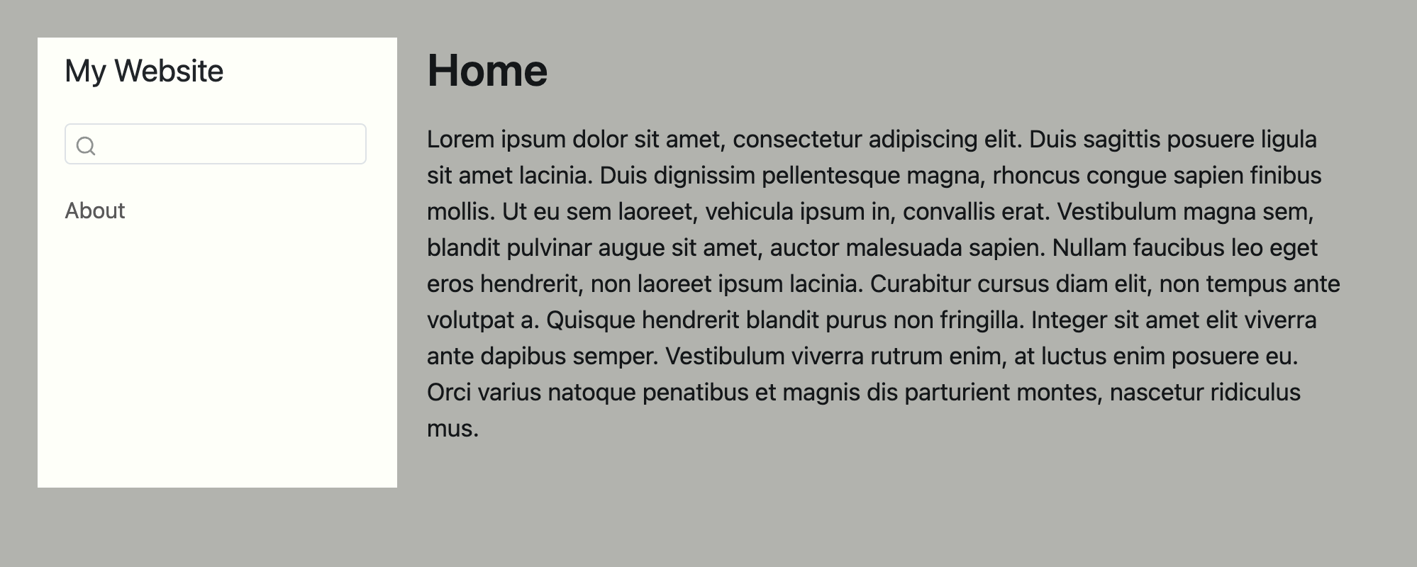
about.qmd.
Top and side navigation bars are configured in _quarto.yml. Figure 14.4 gives the configuration for the two examples in Figure 14.3:
- Top navigation is specified under
navbar, with navigation items listed underleft(orright). - Side navigation is specified under
sidebar, with navigation items listed undercontents.
Both the top navigation bar and side navigation bar collapse into a dropdown menu on small screens. If you are previewing your website in a small window (e.g. the Viewer in RStudio or Positron), you might need to expand the window to see the navigation as displayed in Figure 14.3.
Top and side navigation share many features, you can:
- control the title displayed in the navbar with
title, - include a
logo, along with setting alternative text (logo-alt) and a link (logo-href), in the navigation, - include icon-only navigation items under
tools, and - include a site
searchbox.
One of primary differences between top and side navigation is how deeply you can nest navigational items. Top navigation limits you to one-level of nesting via drop down menus. With side navigation you can nest deeply using sections to create a hierarchy of navigation items.
Top navigation is a good choice when you have a small set of links, each with succinct link text. When you expect users to take a linear path through your site consider side navigation. Side navigation also has the advantage of more easily handling longer link text, and a deeper hierarchy of content.
More complicated sites might benefit from what is known as hybrid navigation (Section 14.5.4), a combination of top and sidebar navigation, where the links in the top navigation direct users to sections of the site which each have their own side navigation.
In the rest of this section, you’ll learn how to specify navigation items more flexibly and then see some more comprehensive examples of top and side navigation. The section ends with a quick survey of navigation elements you can add beyond primary navigation.
14.5.2 Top Navigation
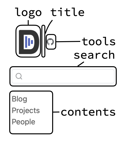
Figure 14.5 illustrates a top navigation bar that includes a logo, title, search box, and navigation links arranged on the left, right and as tools.
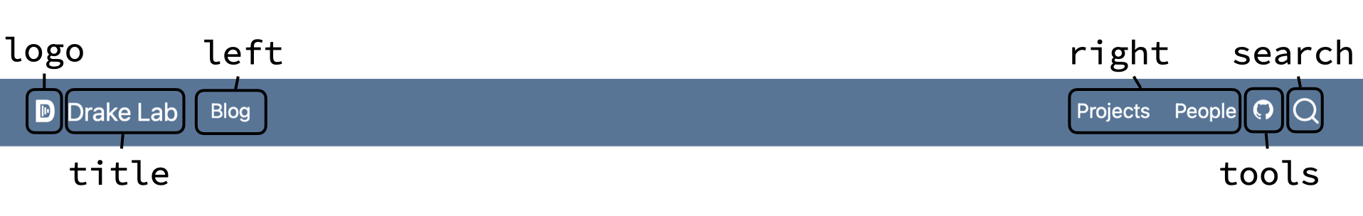
navbar)
The configuration to create this navigation is shown in Snippet 14.1.
This example demonstrates the options to navbar that control the contents of the navigation bar. These options are described further in Table 14.3.
There are additional options to navbar that control its behavior, the are described in Table 14.4. There are also background and foreground options to control the colors in the navigation bar, but unless these are the only color customizations you’ll do, we recommend using the methods outlined in Section 14.6 instead.
14.5.2.1 Nested navigation items
Top navigation bars allow you to nest navigation items by using a dropdown menu. In Figure 14.6 the “People” navigation item, is now a dropdown menu that features links to Staff and Students.
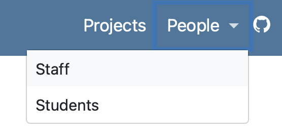
navbar using a dropdown menu
To create a dropdown menu, create a navigation item that has a menu property. In the menu property list the dropdown options as navigation items:
_quarto.yml
website:
  title: Drake Lab
  navbar:
    logo: d-lab.svg
    left:
      - blog.qmd
    right:
      - projects.qmd
      - text: People
        menu:
          - text: Staff
            href: faculty.qmd
          - students.qmd
    tools:
      - href: https://github.com
icon: github14.5.3 Side Navigation
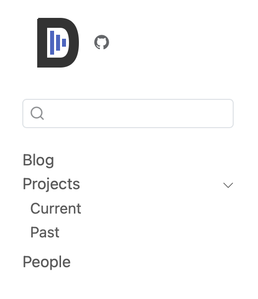
Figure 14.7 illustrates a side navigation bar that includes a logo, search box, and navigation links arranged as contents and tools.
sidebar)
The configuration to create this navigation is shown in Snippet 14.2.
This example demonstrates the options to sidebar that control the contents of the navigation bar. These options are described further in Table 14.5.
There are additional options to sidebar that control its behavior and appearance described in Table 14.6. There are also background and foreground options to control the colors in the navigation bar, but unless these are the only color customizations you’ll do, we recommend using the methods outlined in Section 14.6 instead.
14.5.3.1 Nested navigation
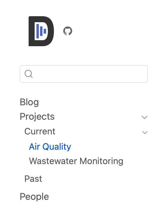
Side navigation bars allow you create nested navigation with expandable sections. Figure 14.8 gives an example where the “Projects” item from Figure 14.7 is now a section that contains two links: “Current” and “Past”.
sidebar using a section
To create a section, add an item to contents that has a section and contents property (Snippet 14.3).
The contents inside a section can contain navigation items, or more sections, allowing you to create deeply nested navigation ( Snippet 14.4, Figure 14.9).
sidebar using a section
14.5.3.2 Automatic side navigation
Rather than specifying navigation items, you can get Quarto to build your navigation items automatically from the content of your website project. To build a navigation menu based on the complete contents of your project set contents to auto at the top-level of sidebar:
_quarto.yml
website:
sidebar:
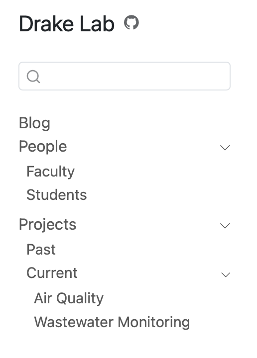
contents: autoThe generated navigation will include items for all the Quarto documents in your project, and respect your project’s structure by nesting your documents in sections that follow your folder’s names. For example, a website the structure shown in Figure 14.10 generates the side navigation bar shown in Figure 14.11.
You can also generate parts of your navigation automatically, by specifying a directory name or glob pattern. See the Quarto documentation on Auto Generation for more examples.
14.5.4 Hybrid navigation
Hybrid navigation combines a top navigation bar with multiple side navigation bars. Links in the top bar, take users to a section of the website with its own side navigation.
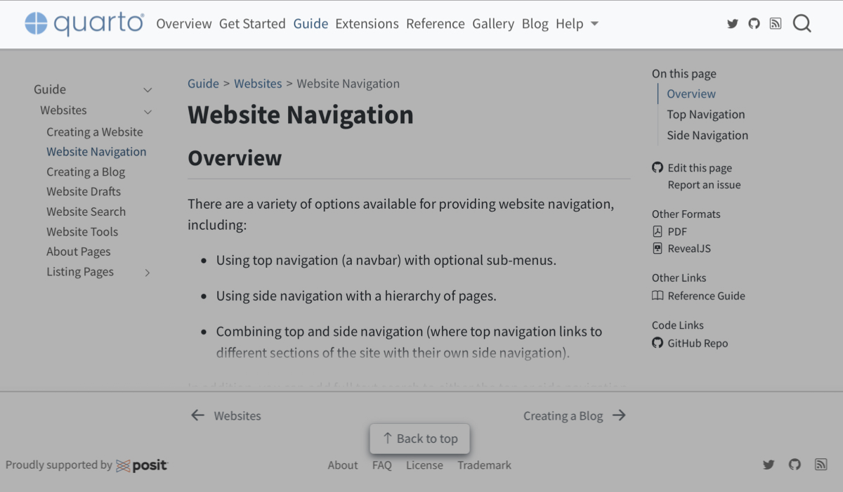
For example, the Quarto documentation site uses hybrid navigation to separate the documentation into, for instance, Guide and Reference (Figure 14.12). Pages in the Guide share a sidebar, but that sidebar is different to that shared by pages in the Reference. Users navigate to the Guide or Reference using the top navigation bar.
To implement hybrid navigation you combine a navbar with an array of sidebars, linking the text of navbar items to the title of the sidebar items.
For example, you might have a navbar that links to Teaching and Research sections:
_quarto.yml
website:
  title: Drake Lab
  navbar:
    left:
      - text: Research
        href: research.qmd
      - text: Teaching
        href: teaching.qmd
For each section to have its own sidebar, sidebar should be an array (i.e. elements prefaced with -), and the title of each item should match the text from an item in the navbar:
_quarto.yml
website:
  title: Drake Lab
  navbar:
    left:
      - text: Research
        href: research.qmd
      - text: Teaching
        href: teaching.qmd
  sidebar:
    - title: Research
      contents:
        - research.qmd
        - project-1.qmd
        - project-2.qmd
    - title: Teaching
      contents:
        - teaching.qmd
        - course-1.qmd
        - course-2.qmd
14.5.5 Other navigation elements
Table 14.7 summarizes other navigation elements beyond the top bar and side bar. We’ve included sidebar and navbar for completeness.
| Element | Option | |
|---|---|---|
| Top navigation Navigation bar that appears at top of page See Section 14.5.2 |
 |
|
| Side navigation Navigation bar that appears on the left side of page See Section 14.5.3 |
 |
|
| Search Search box that appears in top or side navigation |
 |
|
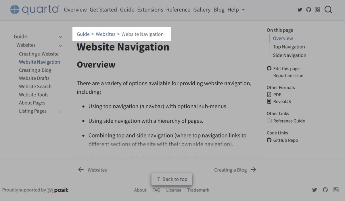
| Breadcrumbs Links above page title that indicate location in sidebar hierarchy |
 |
|
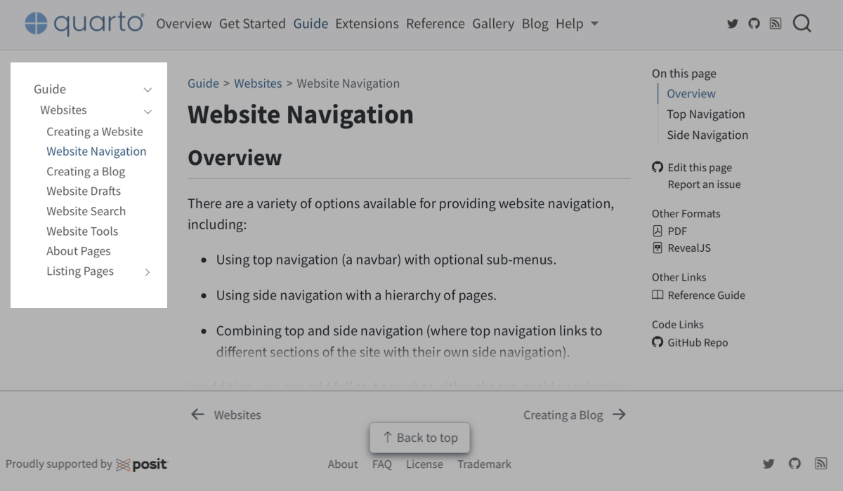
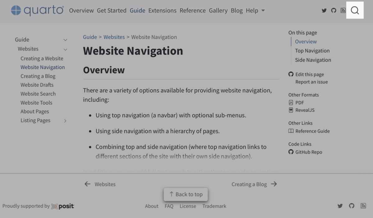
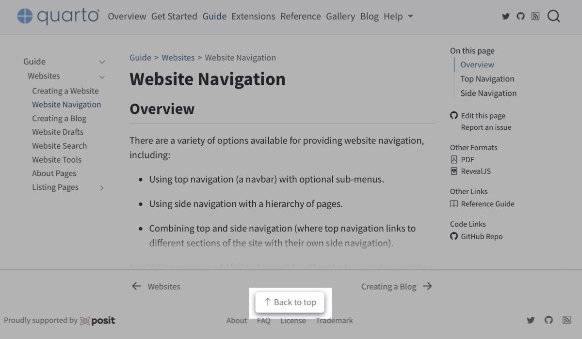
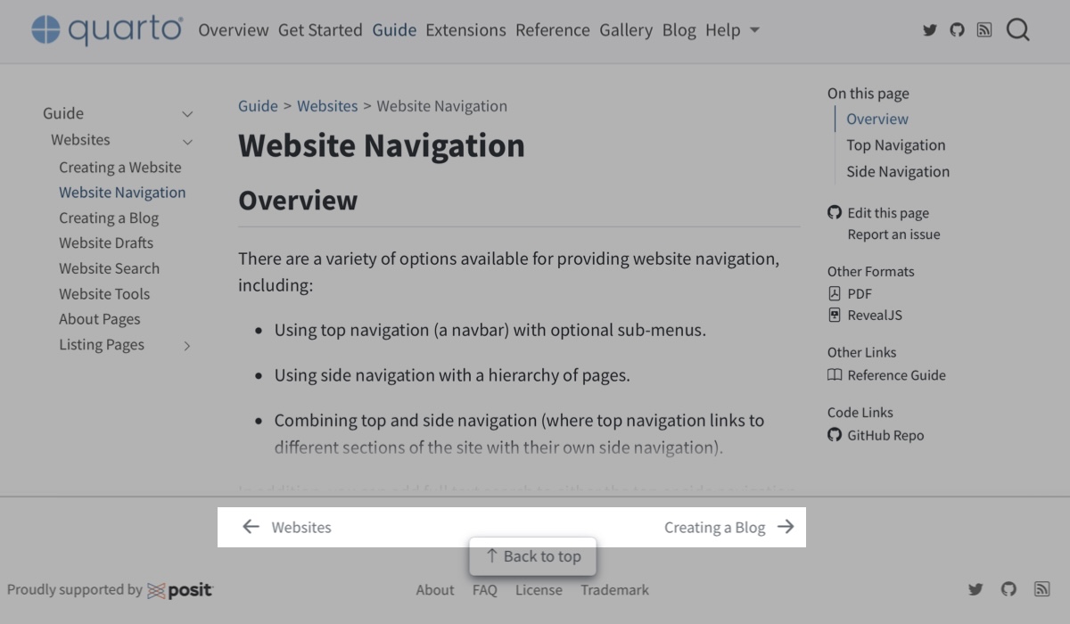
| Back to top Link at the bottom of page to return to the top of the page |
 |
|
| Page footer Content to put in footer on all pages |
 |
page-footer under website in _quarto.yml |
| Page navigation Links at the bottom of page to previous and next page (as defined in sidebar) |
 |
|
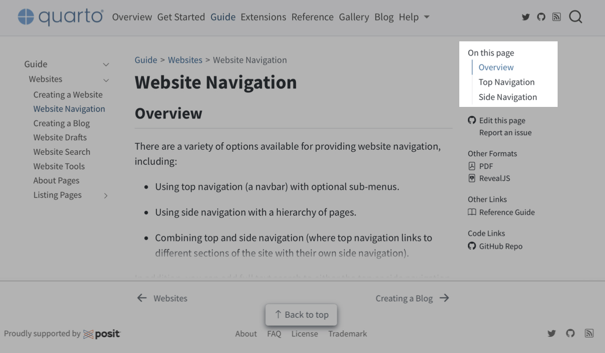
| Table of contents A table of contents to navigate sections within a page, usually shown on right |
 |
|
| GitHub links Links to Github for the page source, to edit the page source, or open an issue. |
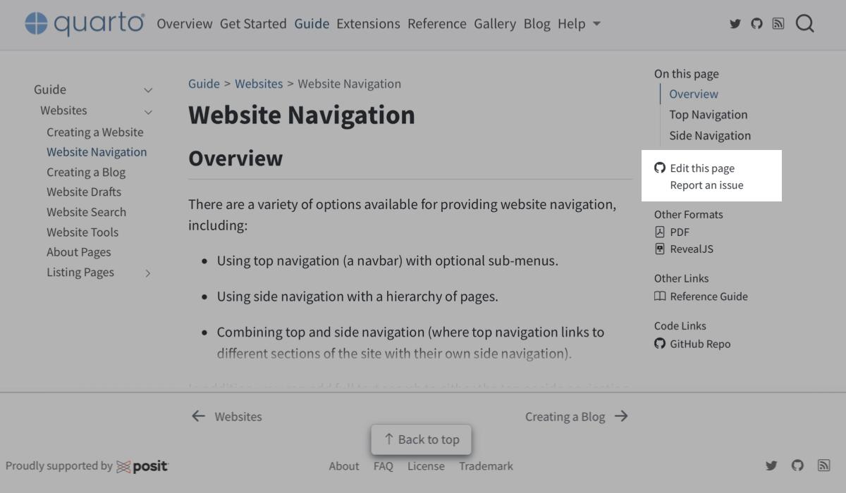 |
repo-url and repo-actions under website in _quarto.yml |
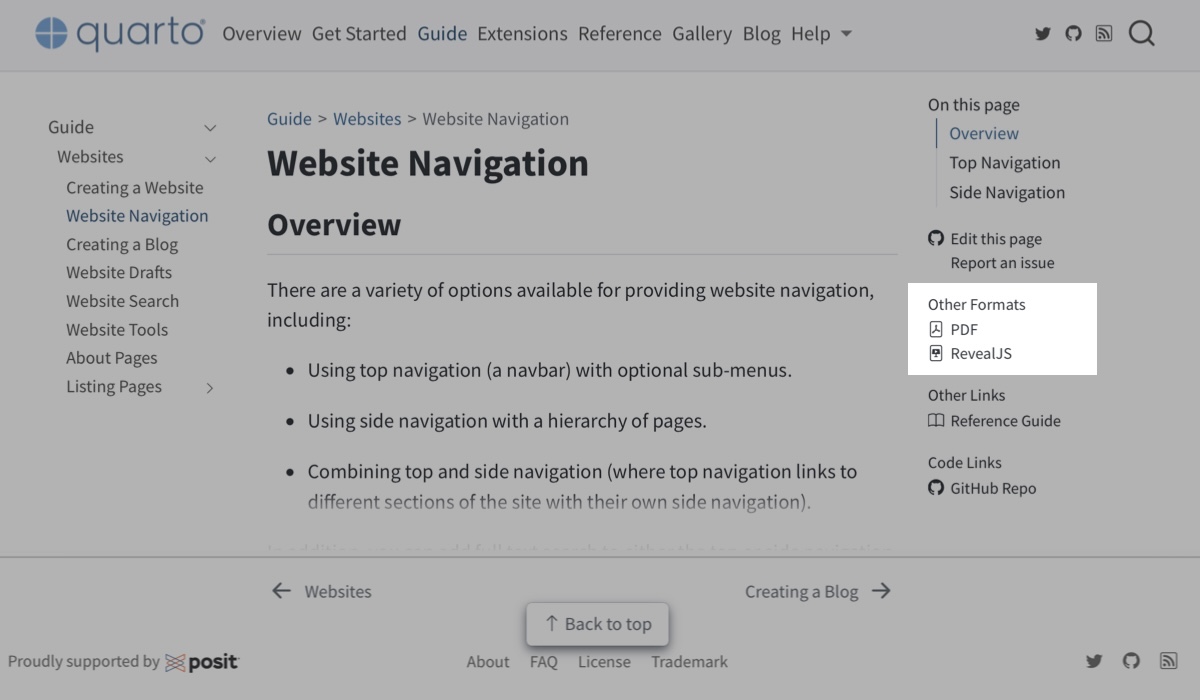
| Other formats Links to other formats shown below table of contents |
 |
|
| Other links Links listed below table of contents in the “Code Links” or “Other Links” sections |
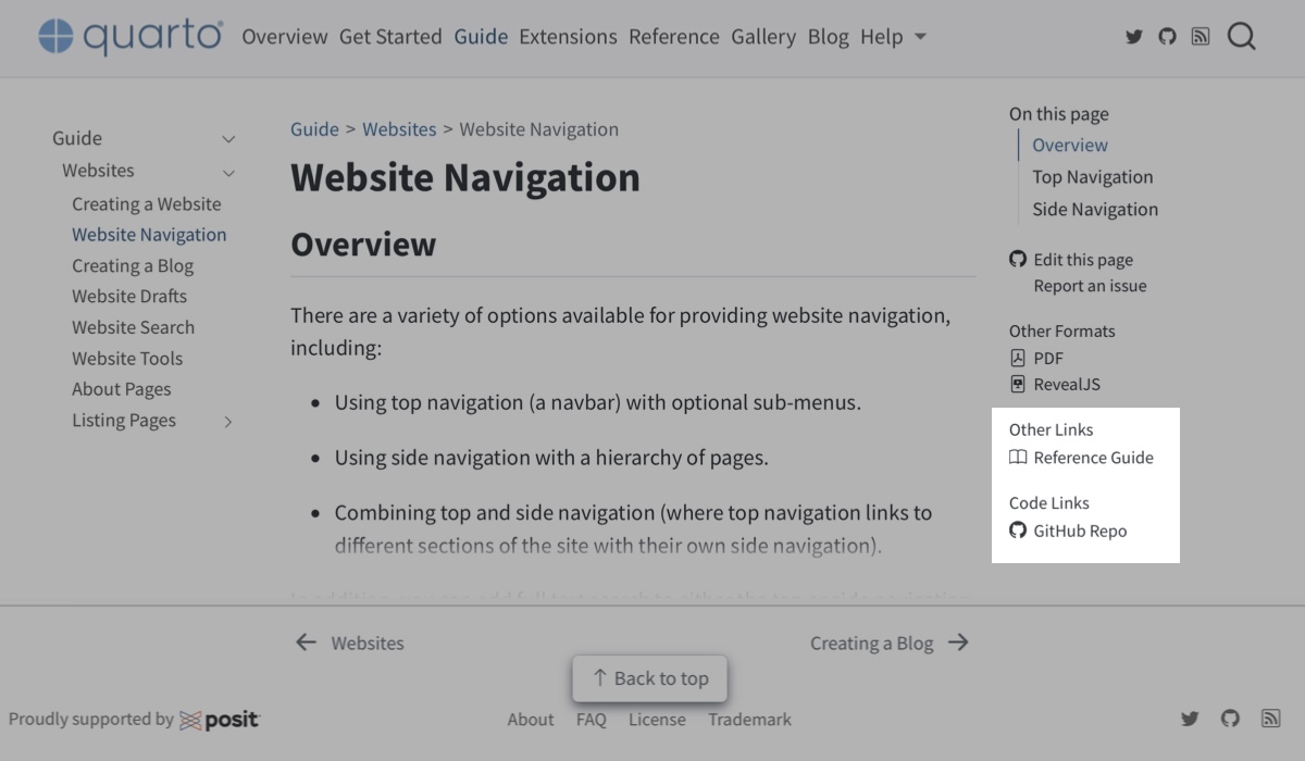 |
code-links, other-links, usually, in document header. |
14.6 Website theming
We use the term theme to describe the visual appearance of your site — things like colors, borders and typography. Because a website is a collection of HTML documents, you control your website theme the same way you control the theme of HTML documents. Since you usually want a consistent theme across all your pages, you’ll specify these HTML document theme options globally in _quarto.yml.
The easiest option is to use a built-in theme. If that doesn’t give you enough customization try brand.yml. And finally, if you need even more control provide your own CSS or SCSS file.
14.6.1 Built-in themes
In the HTML format the theme option controls theming for individual pages. To set a theme for your website, apply one of the built-in themes to every document by setting theme in _quarto.yml:
_quarto.yml
format:
  html:
    theme: lux
The built-in themes for Quarto come from Bootswatch — which is the best place to see what they look like.
14.6.1.1 Dark mode
You can specify the properties light and dark to theme to add a light/dark toggle (Figure Figure 14.13):
_quarto.yml
format:
  html:
    theme:
      dark: cyborg
      light: lux
The property you list first (light or dark) will be the default for the page. Viewers can then switch themes via a toggle in the navigation bar.
light and dark themes that are similar except for color
It’s a good idea to choose themes that are as similar as possible in fonts, padding and other visual elements. This ensures minimal visual disruption as people toggle themes. Another option to maintain visual consistency, is to use a single theme, but apply a light and dark brand (see Section 14.6.3).
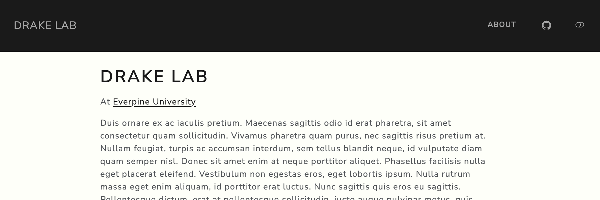
lux used as the light theme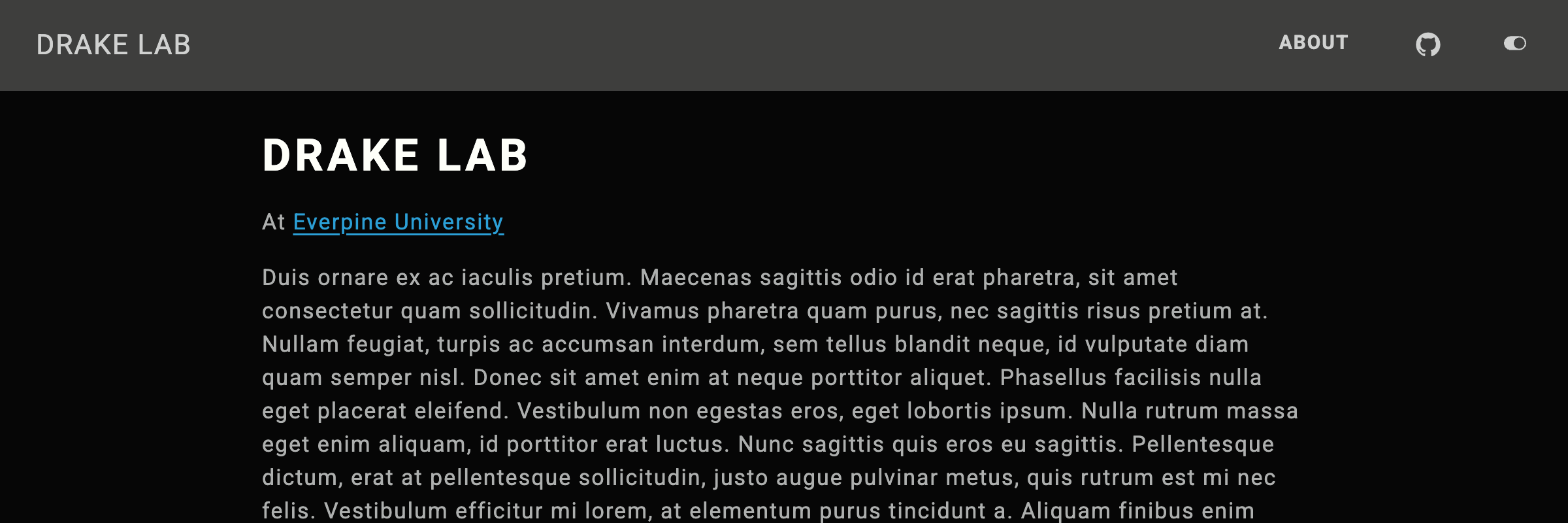
cyborg used as the dark themelight and dark
14.6.2 brand.yml
If you want a custom set of colors and fonts, the easiest approach is through brand.yml. Add a _brand.yml file at the root of your website (i.e. alongside _quarto.yml), and it will apply to all pages.
In particular, the most salient colors on a website are controlled by the color variables background, foreground, and primary:
_brand.yml
color:
  foreground: "#E0EFDE"
  background: "#162627"
  primary: "#8A7090"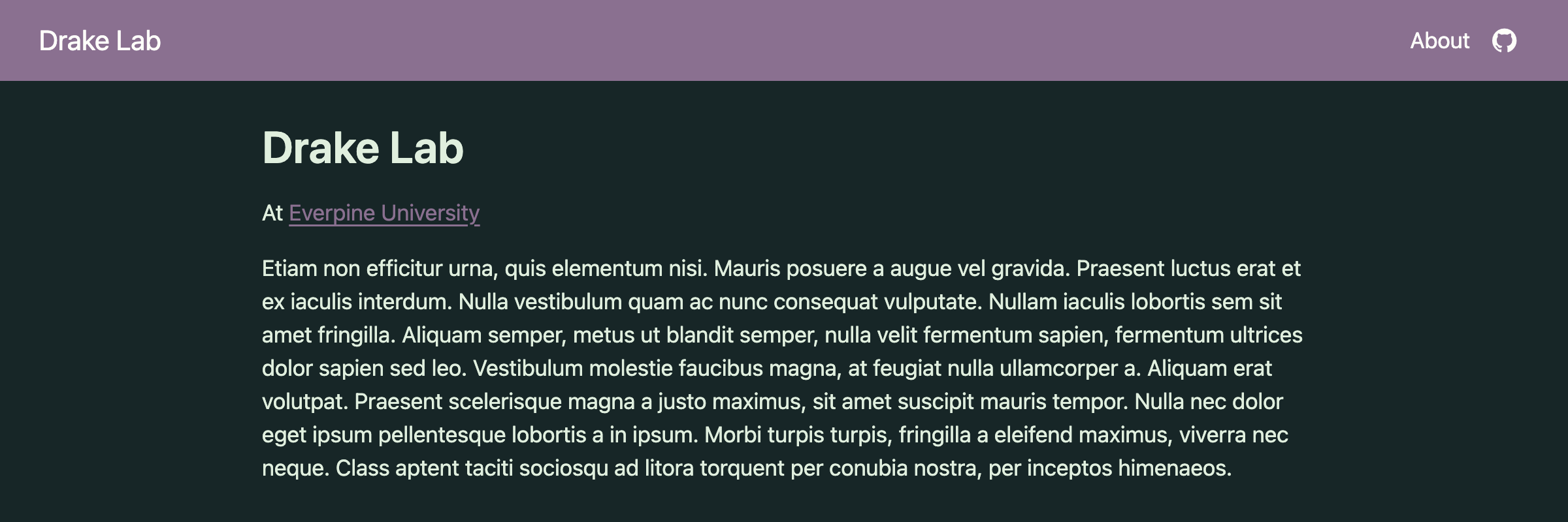
brand to set background, foreground and primary
As you can see in Figure 14.14 primary is used in the top navigation bar and for links. In this example, primary doesn’t have great contrast with the background for text. You can set explicit link text color with the link option to typography:
_brand.yml
color:
  foreground: "#E0EFDE"
  background: "#162627"
  primary: "#8A7090"
typography:
  link:
    color: "#d0a8d8"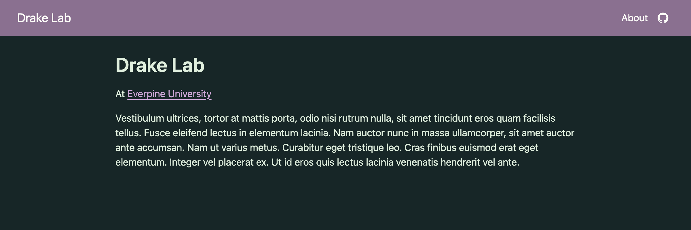
link color in addition to background, foreground and primary
Figure 14.15 illustrates a much better contrast between the link and body background.
As soon as you start having a few colors, you should set a color palette to name your colors. This makes it easier to use each color in multiple places:
_brand.yml
color:
  palette:
    mint: "#E0EFDE"
    charcoal: "#162627"
    light-charcoal: "#243e3f"
    purple: "#8A7090"
    light-purple: "#d0a8d8"
  foreground: mint
  background: charcoal
  primary: purple
typography:
  link:
    color: light-purple
If you do alter background, and your pages include code blocks, you’ll generally also want to change the colors used for code with the typography settings for monospace-inline and monospace-block (Figure 14.16):
_brand.yml
color:
  palette:
    mint: "#E0EFDE"
    charcoal: "#162627"
    light-charcoal: "#243e3f"
    purple: "#8A7090"
    light-purple: "#d0a8d8"
  foreground: mint
  background: charcoal
  primary: purple
typography:
  link:
    color: light-purple
  monospace-inline:
    color: light-purple
    background-color: light-charcoal
  monospace-block:
    background-color: light-charcoal
brand.yml is particularly nice for customizing fonts because all you need is the name of a Google Font. Here’s an example setting the main font (base), the font used for headings of any level (headings), and the font used for code (monospace) (Figure 14.17):
_brand.yml
color:
  palette:
    mint: "#E0EFDE"
    charcoal: "#162627"
    light-charcoal: "#243e3f"
    purple: "#8A7090"
    light-purple: "#d0a8d8"
  foreground: mint
  background: charcoal
  primary: purple
typography:
  fonts:
    - family: Chango
      source: google
    - family: Abel
      source: google
    - family: JetBrains Mono
  base: Abel
  headings: Chango
  link:
    color: light-purple
  monospace: JetBrains Mono
  monospace-inline:
    color: light-purple
    background-color: light-charcoal
  monospace-block:
    background-color: light-charcoal
Swap source: google for source: bunny if you’d prefer Bunny Fonts—a GDPR compliant alternative to Google Fonts.
You can also specify logo in brand.yml as an alternative way to include a logo in top or side navigation. However, if you aren’t using brand.yml across projects, or formats, it may be easier to specify it directly in _quarto.yml as shown in Section 14.5.
You can read about all the options available in the Quarto documentation Guide to using brand.yml.
14.6.2.1 Dark mode
To specify a light and dark theme, and add a light/dark toggle to your site, you can specify two brand files in your website configuration:
_quarto.yml
brand:
  dark: _brand.yml
  light: _brand-light.yml
Where _brand.yml might, as it does above, define a dark mode with a charcoal background and mint text, and _brand-light.yml defines a light mode with a mint background with charcoal text:
_brand-light.yml
color:
  palette:
    mint: "#E0EFDE"
    light-mint: "#EFF7EE"
    charcoal: "#162627"
    light-charcoal: "#243e3f"
    purple: "#8A7090"
    light-purple: "#d0a8d8"
  foreground: charcoal
  background: mint
  primary: purple
typography:
  link:
    color: purple
  monospace-inline:
    color: purple
    background-color: light-mint
  monospace-block:
    background-color: light-mint
14.6.3 Combine brand.yml with a built-in theme
If you want to borrow some features of a built-in theme but use custom colors, you can layer brand with a theme. For example, you might like the upper-case headings and square corners of the lux theme, but you want to use your own colors.
To apply your brand file on top of a built-in theme, you’ll need to specify their order in theme:
_quarto.yml
format:
  html:
    theme: [lux, brand]
_brand.yml
color:
  palette:
    mint: "#E0EFDE"
    charcoal: "#162627"
    light-charcoal: "#243e3f"
    purple: "#8A7090"
    light-purple: "#d0a8d8"
  foreground: mint
  background: charcoal
  primary: purple
typography:
  link:
    color: light-purple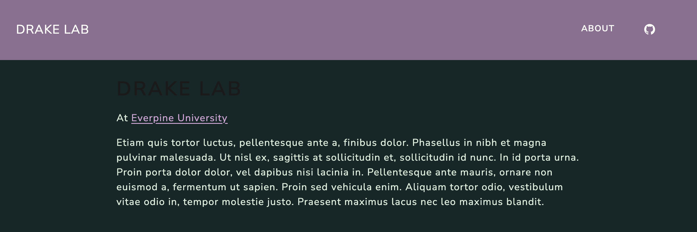
lux built-in theme
Depending on the built-in theme, you may need to be more explicit in your brand file. For example, the theme lux, explicitly sets a color for headings which doesn’t work well with a dark background (Figure 14.18). This explicit value wins over the implicit inheritance from base in the brand file. You can fix it by specifying headings explicitly in the brand file (Figure 14.19):
_brand.yml
color:
  palette:
    mint: "#E0EFDE"
    charcoal: "#162627"
    light-charcoal: "#243e3f"
    purple: "#8A7090"
    light-purple: "#d0a8d8"
  foreground: mint
  background: charcoal
  primary: purple
typography:
  link:
    color: light-purple
  headings:
    color: mint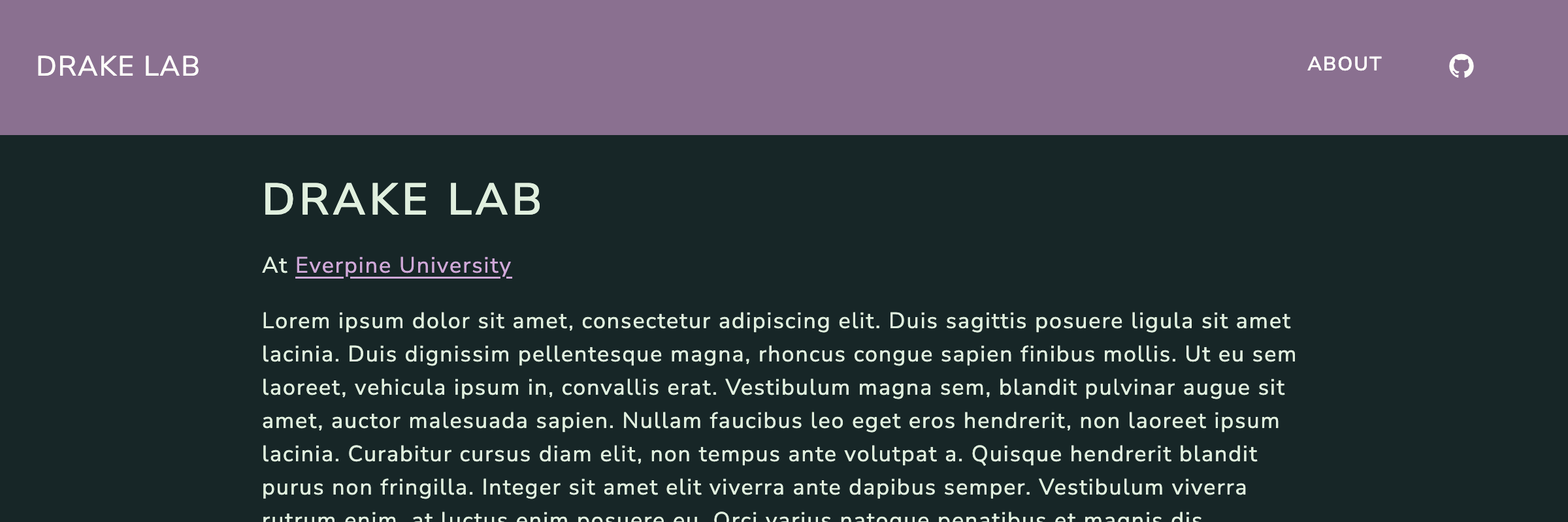
lux
14.6.3.1 Dark mode
If you have a light and dark brand, you can also layer them with a built-in theme. In your website configuration, you’ll specify your brand file under the light and dark properties for brand, and their layering with a built-in theme in the light and dark properties of theme:
_quarto.yml
brand:
  dark: _brand.yml
  light: _brand-light.yml

format:
  html:
    theme:
      dark: [lux, brand]
      light: [lux, brand]
When you layer light and dark brands with built-in themes, you’ll likely find a number of places the colors don’t quite work. In that case, you’ll likely need to make some color tweaks with CSS/SCSS.
14.6.4 Adding CSS or SCSS
CSS and SCSS are languages for specifying how HTML documents should look visually. CSS (Cascading Style Sheets) is the older and more verbose language. SCSS (a variant of SASS, Syntactically Awesome Style Sheets) is like CSS with superpowers adding things like variables, nested rules, and mixins.
The options for theming you’ve seen so far, using built-in themes and brand.yml, are implemented with SCSS, which is ultimately translated to CSS for a web browser to display. Quarto gives you two opportunities to inject your own rules in this process:
Adding a CSS file to the rendered document using
css.Inserting a SCSS file into Quarto’s SCSS layering system with
theme.
You won’t learn the details of CSS or SCSS in this book, but we’ll show you a couple of examples of the kinds of customization they allow beyond built-in themes and brand.yml.
14.6.4.1 CSS
You can use CSS to apply styling exceptions to specific elements in your HTML document. CSS rules consist of a selector that identifies which elements the rule applies to, and a series of declarations that describe the styling to apply to the element.
As an example, this rule applies to first level headings (h1) and sets the font color (color) to purple (#d0a8d8):
h1 {
  color: #d0a8d8;
}
If you save this rule in a file called styles.css, you can apply it to your documents using the css option:
_quarto.yml
format:
  html:
    css: styles.css
In Quarto HTML documents, the h1 tag is reserved for the page title, so this has the effect of changing the color of the title, but no other headings.
As another example, a CSS selector can be based on an elements class. The website title in the navbar has the class .navbar-title, so a CSS rule could change the font of this title:
.navbar-title {
  font-family: Chango;
}
If you’ve already used the same font in _brand.yml, this is enough. Otherwise, you’ll also need to include CSS to import the font:
@import url('https://fonts.googleapis.com/css2?family=Chango&display=swap');

.navbar-title {
  font-family: Chango;
}
14.6.4.2 SCSS
To add SCSS to a Quarto document you need to provide a file split into sections using a special annotation. The content of these sections is then spliced into Quarto’s SCSS before it gets compiled to CSS. Adding your own SCSS allows you to set (or change) variables that affect many parts of the final CSS.
Here, we’ll only touch on the two most commonly edited sections: rules and defaults. You can read more in the Quarto documentation on More about Quarto Themes.
14.6.4.2.1 Rules (rules)
The rules section is the last section and contains CSS rules, but with the added benefit of SCSS features. For example, you could take a CSS rule from above, and instead place it in a SCSS file, along with the required annotation /*-- scss:rules --*/:
styles.scss
/*-- scss:rules --*/
h1 {
  color: #d0a8d8;
}
To insert this SCSS into Quarto’s SCSS layering system, you provide the file to the theme argument:
_quarto.yml
format:
  html:
    theme: styles.scss
One advantage of putting CSS rules in SCSS is you can use variables for values. For instance, rather than a hex code for a color, you could refer to a Quarto SCSS variable:
styles.scss
/*-- scss:rules --*/
h1 {
  color: $brand-light-purple;
}
Now if you change your definition of light-purple in _brand.yml you won’t need to change it in a CSS file as well. Another advantage is being able to use functions from SASS like lighten() and darken():
styles.scss
/*-- scss:rules --*/
h1 {
  color: darken($brand-mint, 10%);
}
You can layer your custom SCSS with any other elements you might already have (Figure 14.20):
_quarto.yml
format:
  html:
    theme: [lux, brand, styles.scss]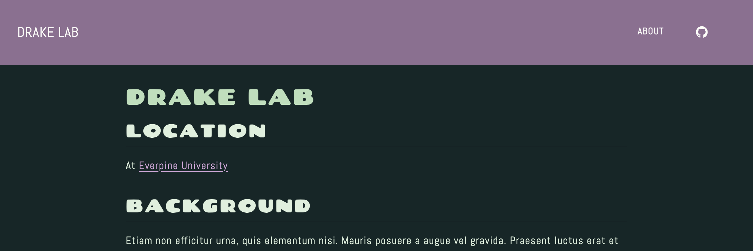
14.6.4.2.2 Defaults (defaults)
The defaults section comes earlier than rules and is used to set the values of variables. You can use it to define your own variables to use later, or more commonly to override Quarto’s SCSS variables.
For example, Quarto provides SCSS variables to alter the size of the different heading levels. You could shrink the second level headings a little from the default with:
styles.scss
/*-- scss:defaults --*/
$h2-font-size: 1.5em;
All the available SCSS variables are listed in the Quarto documentation under Sass Variables. Many of the SCSS variables duplicate the functionality you get via brand.yml. For websites, the variables that are most useful are those around navigation. In particular, navbar-bg, navbar-fg, navbar-hl, control the color of the top navigation bar background, text (e.g. foreground), and text on hover, and sidebar-bg, sidebar-fg, and sidebar-hl do the same for the side navigation bar.
As an example, you might want to override brand.yml selection of primary for the navigation bar (Figure 14.21):
styles.scss
/*-- scss:defaults --*/
$navbar-bg: "#E0EFDE";
$navbar-fg: "#162627";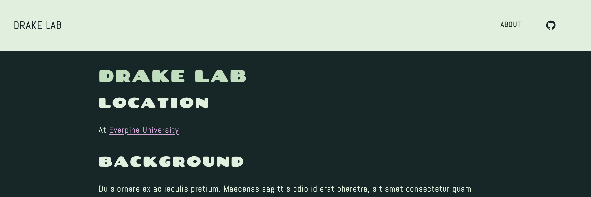
If you want to refer to your brand colors in the defaults section, you’ll need to layer your SCSS higher in theme so that the brand variables are defined by the point you want to use them. For example, to achieve the same result as above, but without re-specifying the hex colors, you could have:
styles.scss
/*-- scss:defaults --*/
$navbar-bg: $brand-mint;
$navbar-fg: $brand-charcoal;
However, you need to put styles.scss in theme first:
_quarto.yml
format:
  html:
    theme: [styles.scss, brand]
14.6.4.2.3 Control SCSS in brand.yml
An alternative to a custom SCSS file, is to specify SCSS in the defaults: bootstrap section of _brand.yml. The names of the options to bootstrap correspond to the sections in Quarto SCSS files, with the additional convenience that defaults can take a mapping of SCSS variables to values.
Figure 14.22 shows a side-by-side comparison of using brand.yml versus a custom SCSS file.
styles.scss
/*-- scss:defaults --*/
$navbar-fg: $brand-charcoal;
$navbar-bg: $brand-mint;

/*-- scss:rules --*/
h1 {
  color: $brand-light-purple;
}

.navbar-title {
  font-family: Chango;
}
_brand.yml
defaults:
  bootstrap:
    defaults:
      navbar-bg: $brand-mint
      navbar-fg: $brand-charcoal
    rules: |
      h1 {
        color: $brand-light-purple;
      }
      .navbar-title {
        font-family: Chango;
}_brand.yml.
Specifying SCSS in _brand.yml means you only have one file to copy to apply the same style to another project, however, you lose the SCSS language support your IDE might provide to a .scss file.
14.6.5 The role of Bootstrap
Bootstrap is a framework that helps make websites and web documents look polished and responsive without requiring extensive custom CSS. Quarto uses Bootstrap to implement layout, so that pages look good on both mobile and desktop devices, and to implement elements like callouts and navigation bars. As a Quarto user you don’t need to know anything about Bootstrap, but knowing a little opens up some ways to further customize your site.
14.6.5.1 Bootstrap classes
Bootstrap exposes a ton of CSS classes to style elements. Because Quarto HTML documents use Bootstrap, you can use these Bootstrap classes within your own documents.
As an example, Bootstrap includes a button component:
<a class="btn btn-primary" href="#" role="button">Link</a>The key information is in class. To make a link look like a button, use the usual syntax, but add the classes prefaced by a . in curly braces:
[See Source](http://github.com){.btn .btn-primary}When rendered, you’ll get a link that looks like a button:
You’ll need to pay attention to the kind of object Bootstrap classes apply to and match to the appropriate Quarto syntax. Table 14.8 gives some examples of applying Bootstrap classes to a span, div, and table.
| Component | Class | Element | Quarto Markdown | Rendered | ||
|---|---|---|---|---|---|---|
| Badge | badge |
<span> |
### Example heading [New]{.badge .text-bg-primary} |
Example heading New |
||
| Border Utility | border , rounded and more |
Also applies to |
|
Some content |
||
| Accented Tables | table-striped |
<table> |
|
|
14.6.5.2 Bootstrap SCSS variables
Bootstrap uses SCSS variables, like Quarto does, to control aspects of the many CSS rules in a single place. Assuming neither Quarto, nor your theme, overrides them, you can set them yourself just like Quarto SCSS variables.
For example, by setting border-width and border-style you can affect all borders added by the border class:
styles.scss
/*-- scss:defaults --*/
$border-width: 2px;
$border-style: dashed;
You can find a list of the Bootstrap SCSS variables available by examining the bootstrap/dist/scss/_variables.scss file in the Quarto source code.
14.7 About Pages
About pages are a special kind of page that combines your page content and document metadata into an attractive template—great for “About” pages and other landing pages.
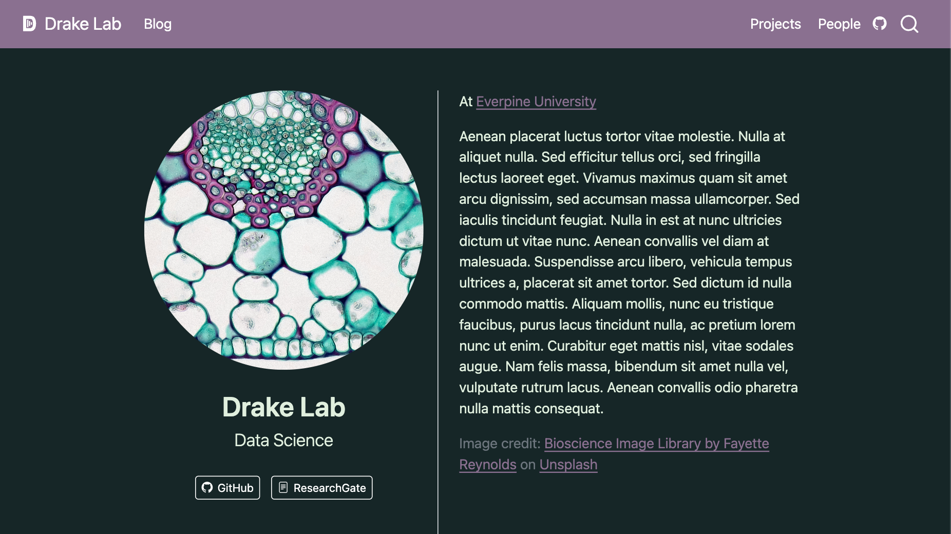
trestles template. Document metadata is used to populate the left side of the page. Document content is used to populate the right side of the page.
Figure 14.23 shows an example of an about page used for a landing page. The content on the left, a title, subtitle, image and links, are specified in the document metadata. The content on the right, comes from the content of the page source, e.g. the body of index.qmd.
Snippet 14.5 shows the document meta data for the example in Figure 14.23. You add an about page template to a page by adding the about option and specifying a template. In this case the trestles template is used, other options include jolla, solana, marquee, and broadside.
The about option can take title, subtitle, image and image-alt options, but if they aren’t specified it will use those specified at the document level. Additionally, about takes a links option, an array of navigation items (Section 14.5.1) styled using the template.
index.qmd
---
title: Drake Lab
subtitle: Data Science
about:
  template: trestles
  image: profile.jpg
  image-alt: Magnified image of cells
  image-shape: round
  links:
    - icon: github
      text: GitHub
      href: https://github.com
    - icon: file-text
      text: ResearchGate
      href: https://www.researchgate.net
---
You can read more in the Quarto documentation on About Pages.
14.8 Listings
Listings are a special kind of page that contains an automatically generated list of content. Listings are often used to create blogs, but can also be used more generally any time you want a list of similar pages or items, like talks, publications, projects or people.
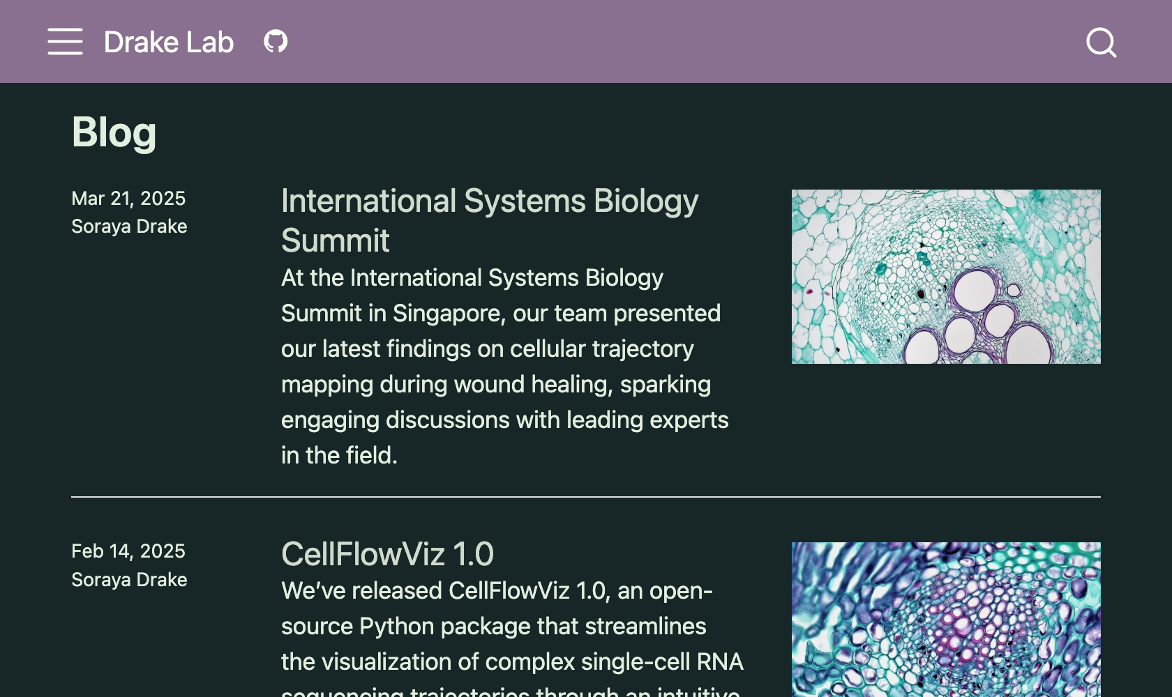
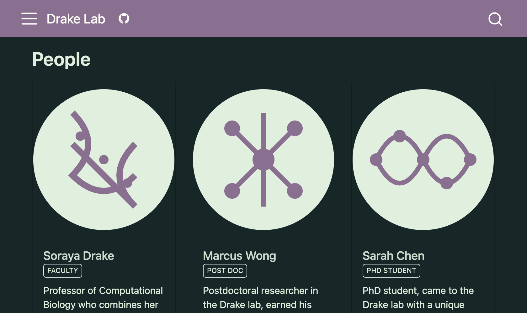
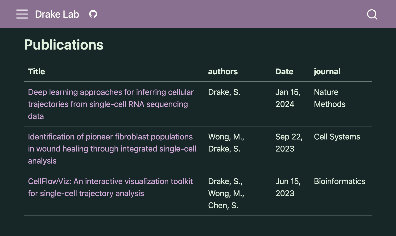
Figure 14.24 shows three examples of listing pages: a blog, a people listing , and a list of publications. The appearance of the items is controlled by the type of listing: default, grid, or table. If you need more customization you can also build your own custom template (see Custom Listings in the Quarto documentation).
type: default
type: grid
type:table
The items in a listing can be other Quarto documents in the project, or specified using YAML. For example, the blog listing in Figure 14.24 (a) is generated using other Quarto documents — the documents that contain the blog posts themselves. The listing is added to the blog.qmd page, by adding a listing option to the document header and specifying the contents as the folder posts/:
blog.qmd
---
title: Blog
listing:
  contents: posts/
  sort: date desc
---
The listing will contain any Quarto documents found in posts/, or any subfolder. The information to populate the listing items comes directly from the document metadata.
posts/first-post.qmd
---
title: Single-Cell RNA Sequencing Reveals Novel Cellular States During Wound Healing
image: bioscience-image-library-by-fayette-reynolds-_GajiPiqv9s-unsplash-2.jpg
image-alt: Magnified cells
description: |
  Our lab used single-cell RNA sequencing (scRNA-seq) to study wound healing, analyzing 50,000 cells across multiple time points. This revealed novel cellular states and transition pathways with potential applications in regenerative medicine.
author: Soraya Drake
date: 2025-01-11
categories: [research, conferences]
---
To use a YAML file to populate a listing, provide the path to the YAML file to contents:
publications.qmd
---
title: Publications
listing:
  contents: publications.yml
  type: table
  sort-ui: false
  filter-ui: false
---
Your YAML file should then contain an array of items:
publications.yml
- title: "Deep learning approaches for inferring cellular trajectories from single-cell RNA sequencing data"
  authors: "Drake, S."
  date: "2024-01-15"
  journal: "Nature Methods"
  path: "https://doi.org/10.1038/s41592-024-01234-5"

- title: "Identification of pioneer fibroblast populations in wound healing through integrated single-cell analysis"
  authors:
    - "Wong, M."
    - "Drake, S."
  date: "2023-09-22"
  journal: "Cell Systems"
  path: "https://doi.org/10.1016/j.cels.2023.09.003"

- title: "CellFlowViz: An interactive visualization toolkit for single-cell trajectory analysis"
  authors:
    - "Drake, S."
    - "Wong, M."
    - "Chen, S."
  date: "2023-06-15"
  journal: "Bioinformatics"
  path: "https://doi.org/10.1093/bioinformatics/btad234"
14.9 Publishing a website
To get your website out to your audience you’ll need to publish it somewhere. In this section, you’ll first learn about website metadata you’ll likely want to set before publishing that will make it easier for people to find and share your website. Then, you’ll learn about the most common approaches to publishing your site: the quarto publish command or hosting the _site folder.
14.9.1 Website metadata
Before you publish your website, you’ll want to make sure you’ve set some website metadata (Snippet 14.6):
titleanddescriptionare generally what a search engine will display if your site is returned in a search.titleis also added to page titles to provide the tab label in a browser.site-urlshould be set to the address for your hosted website. A number of Quarto features rely on this being set, but most relevantly, you can’t use relative links forimagewithout it.Set
open-graphand/ortwitter-cardtotrueto have Quarto add the metadata required to provide previews when you share your URL in social apps.Provide
imagea path to the image you want to be used in social cards. This image will be used for any page that doesn’t otherwise specify animage. Provideimage-altwith alternative text for the image.
_quarto.yml
website:
  title: Drake Lab
  description: A computational biology lab at Evergreen University led by Soraya Drake
  site-url: https://www.drakelab.org
  open-graph: true
  image: card.png
  image-alt: Magnified view of a cell
An example of a social card built from Snippet 14.6 is shown in Figure 14.25.

title, description, image and image-alt.
You can define title, description and image/image-alt at the website level in _quarto.yml, or in document metadata. Quarto will prefer the document metadata, but fall back to website metadata if document values aren’t set.
14.9.2 quarto publish
You saw how to use quarto publish to publish a single document in Chapter 6. To publish a website using quarto publish simply run Quarto publish from the project root:
quarto publishThis will prompt you to select a provider and to authenticate. Then Quarto runs quarto render one more time (you can disable this with --no-render), pushes the _site/ directory to the provider, then opens the site in your browser (you can disable this with --no-browser). This process is illustrated in Figure 14.26. We’ve separated out the “render” and “publish” step, but both steps happen when you call quarto publish.
After publishing, you’ll find a _publish.yml file in your website project which records the details of where you published. If you publish again, you’ll be asked if you want to publish an update to the destinations recorded in this file, or to a new destination.
The publish command is primary just moving _site/ to the right place on your provider.
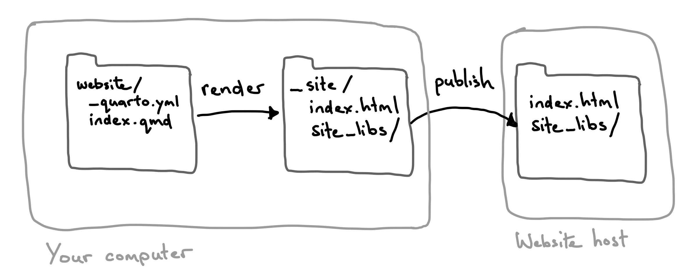
quarto publish process for a website. The website project is rendered locally, then the rendered site, site/ (or docs/), is uploaded to the website host.
14.9.3 Publish _site/
Once you’ve rendered your website, the _site/ folder contains everything needed for your website. So, if your website host isn’t supported by quarto publish, you simply need to get the contents of _site/ to your provider. It you go this route, you’ll always need to manually run a full render before transferring _site/. From the root of your website project run:
quarto renderAs a concrete example, Netlify (although also supported by quarto publish) has a drag and drop UI for deploying a website called Netlify Drop. Drop in _site/, and Netlify will give you a URL at which your site is available.
14.9.4 Providers
The quarto publish command supports several publishing providers. The three we think are most useful if you are choosing for yourself are Posit Connect Cloud, GitHub Pages, and Netlify. A brief summary comparing their features is shown in Table 14.9.
| Provider | Private Source | Private Site | Custom Domain |
|---|---|---|---|
| Posit Connect Cloud | ✔️ | Paid plans | Paid plans |
| GitHub | Paid plans | GitHub Enterprise Cloud only | ✔️ |
| Netlify | ✔️ | Paid plans | ✔️ |
You can specify the provider directly in the call to quarto publish:
Terminal
quarto publish posit-connect-cloud14.9.4.1 GitHub Pages
Terminal
quarto publish gh-pagesGitHub Pages is a hosting service provided by GitHub at the repository level. If you are storing your source on GitHub anyway, it makes sense to also publish via GitHub Pages.
When you publish, Quarto creates a special gh-pages branch, renders your document or project to this branch, and pushes this branch to GitHub. This branch is then processed on GitHub’s side, making it available at a URL of the form { user }.github.io/repo-name.
If you use GitHub through one of its “Free” plans you can only use GitHub Pages on public repositories. If you’d prefer your source documents weren’t available publicly you’ll either need to upgrade your GitHub plan, or use something like Netlify or Posit Connect Cloud instead.
You can read more about publishing to GitHub with quarto publish on the GitHub Pages page in the Quarto documentation.
An alternative to using quarto publish is to commit your rendered document or site to your repository in a docs/ folder and set GitHub Pages to publish from there. You can read more about this workflow at Render to docs on the Quarto documentation website.
14.9.4.2 Netlify
Terminal
quarto publish netlifyNetlify provides services for building, deploying, and managing websites. When you publish to Netlify using quarto publish, your document or site will be set up as what Netlify calls a manual deploy — you deploy by manually running quarto publish. Your output files are sent to Netlify and Netlify serves them at a URL of the form { random identifier }.netlify.app.
You can manage your deployed site via Netlify’s website, and Netlify includes some neat features like one-click rollbacks to a previously deployed site, and the ability to use a custom domain. Netlify’s free plans limit how many sites you can have and how much bandwidth is used to serve them. However, these limits will likely not be reached for low-traffic personal sites.
Rather than using quarto publish you can get Netlify to deploy from Git provider. In this workflow, you commit your rendered document or site to your repository in a folder (e.g. docs/ or _site/) and connect Netlify to your Git provider, setting the folder as the Publish directory. You can read more about this on the Quarto documentation website at Publish from a Git Provider.
Netlify excels in continuous integration and you can set it up to preview deployments based on branches or pull requests. These features require a more complicated publishing setup you’ll learn about in Section 14.10.
14.9.4.3 Other providers
You are most likely to use Posit Connect or Confluence in organizational settings where your IT department will manage them. Hugging Face has a more complicated setup and probably only makes sense if you are using Hugging Face beyond Quarto already.
You can read more about the details of publishing in the Publishing Guide on the Quarto documentation website.
14.10 Continuous integration
The methods discussed in Section 14.9 involve you manually invoking publishing, e.g. by running quarto publish. Continuous integration is a term for an automatic publishing process where publishing is triggered by some other event. That event might an action like pushing to a GitHub repository, or be based on a schedule.
When talking about continuous integration there could be up to three other parties involved: the host for your source code (usually in a Git repo), the provider of the continuous integration service, and the publishing venue. They might all be the same. For example, you might host your source code on GitHub, implement continuous integration with GitHub Actions, and publish to GitHub Pages. However they don’t have to be. For instance, you might host your source code on GitHub, and use GitHub Actions, but publish to Netlify.
When you automate publishing, you’ll need to consider where you want code execution and rendering to occur, locally or on a remote server.
Your options are:
Local code execution and rendering: you manage your computational environment (R, Python, Julia etc), and Quarto installation locally, and manually run
quarto render. Your CI service handles publishing to the web, usually by monitoring changes to a Git repo.Local code execution with remote rendering: you manage your computational environment (R, Python, Julia etc) locally, and use
_freeze/to store the results of the computational engine. You set up your CI service to install Quarto and runquarto renderand publish.Remote code execution and remote rendering: your CI service needs to install and set up your computational environment, install Quarto, run
quarto render, and publish.
Table 14.10 compares these three options for a minimal website with the file structure:
├── _quarto.yml
└── index.qmd
In all three cases, the final outcome is the contents of _site/ is hosted on the publishing provider:
_site/
├── index.html
└── site_libs| Code/Render | On your computer | In the repo | On CI | Tools required on CI |
|---|---|---|---|---|
| Local/Local | quarto render |
|
When triggered, deploys _site |
|
| Local/Remote | quarto render |
|
When triggered, renders based on _freeze,and publishes. E.g. quarto publish |
|
| Remote/Remote | Nothing required. |
|
When triggered, renders and publishes. E.g. quarto publish |
|
14.10.1 Local code execution and local render
When you execute code locally and render locally, _site/ contains all of the required website source. One approach to automating publishing is to check your website source into version control and let a provider handle the automation. From your perspective, you run quarto render locally, then push the changes to your repository. Your provider then updates the deployed site.
This approach is the easiest to set up—you generally don’t need to do anything except connect your repo to your CI service. However, you can end up with commits with large diffs (the changes to the source documents, and all the changes to the rendered output in _site/ or docs/). These large diffs are cumbersome to review, and take longer to send to your Git remote host.
Two examples of this approach are:
Github deploy from
docs/(as described in Section 14.9.4.1). GitHub is the host for your source code, the provider of the CI and the publishing venue.Netlify deploy from a Git provider (as described in Section 14.9.4.2). Any supported Git provider is the host for your source code, and Netlify is the CI provider and publishing venue.
Alternatively, you could set up your own automation (e.g. via GitHub Actions) that deploys your content on any push to your repo.
14.10.2 Local code execution and remote render
Local code execution, with remote rendering provides a good middle ground. You aren’t burdened with setting up, and maintaining a remote code execution environment, but you also don’t have to store a whole lot of rendered output in your repo.
This approach requires using freeze to store the results of the code execution. You run quarto render locally, as required, to generate _freeze/. You then check _freeze/, but not _site/, into version control. Your CI agent then uses the Quarto CLI to render and publish your site.
The most common CI service for this approach is GitHub. The project source is stored in a GitHub repo, and a GitHub Action is used to setup Quarto, and run the required Quarto commands. The Quarto command could be as simple as quarto publish {venue}, which allows your publishing venue to be any of those supported by quarto publish.
14.10.3 Remote code execution and remote render
Remote code execution combined with remote rendering provides the most protection for keeping your work reproducible—your CI will fail as soon as it isn’t. However, it comes with the most setup, maintenance, and cost (time and potentially money) since all the work is happening on a remote server.
You now only check your source documents (e.g. .qmd files) into version control. Your CI service needs to install your computational environment, so you likely will also create and check-in a record of the packages required (e.g. using renv for R, or requirements.txt, pipenv, or uv for Python). When your CI runs, it will install your computational environment, install Quarto, and then run a full render and publish.
The two most popular choices for CI provider in this case are GitHub Actions, and Posit Connect Cloud. In both cases your source code is hosted on GitHub.
Posit Connect Cloud has the advantage of very little setup. You simply connect your repo to your Connect Cloud account, and Connect Cloud handles the automation, including managing your computational environment for common R and Python setups.
You’ll learn more about GitHub Actions in the next section.
14.10.4 GitHub Actions
GitHub Actions are the most common method for setting up continuous integration for publishing Quarto websites. GitHub Actions are defined by a workflow, a series of steps that will be run on servers (usually GitHub’s), in the context of a GitHub repository.
To use GitHub Actions you necessarily need to have your website in a repository on GitHub. You then set up a workflow file, a YAML file that lives in your project in the folder .github/workflows/.
GitHub Actions can be incredibly flexible, so rather than outline all your possibilities we’ll walk through an example and point out places you could implement more flexibility.
Consider the workflow, publish.yml, shown in Snippet 14.7 which might be used for a project that uses local code execution with remote rendering. The workflow file sets up a single job build-deploy that consists of three steps:
Get the project source by checking out the repository
Install the Quarto CLI
Run
quarto publish gh-pages
Each of these steps is implemented by using an action defined by someone else (as specified in uses): GitHub itself in the first case, and the Quarto development team in the second and third. The definitions of these actions are also found on GitHub where you can often find more details about their use. For example, you can find about more the publish action at https://github.com/quarto-dev/quarto-actions/tree/main/publish#readme.
.github/workflows/publish.yml
1on:
  workflow_dispatch:
  push:
    branches: main

2name: Quarto Publish

3jobs:
4  build-deploy:
    runs-on: ubuntu-latest
    permissions:
      contents: write
5    steps:
6      - name: Check out repository
        uses: actions/checkout@v4

7      - name: Set up Quarto
        uses: quarto-dev/quarto-actions/setup@v2

8      - name: Render and Publish
        uses: quarto-dev/quarto-actions/publish@v2
        with:
          target: gh-pages
        env:
GITHUB_TOKEN: ${{ secrets.GITHUB_TOKEN }}- 1
-
Describes when this workflow should trigger. In this case, on any pushes to the
mainbranch, or manually (workflow_dispatch). - 2
- A name for the workflow displayed in GitHub Action’s UI.
- 3
-
A workflow can have one or more
jobsthat run in parallel. Most Quarto CI workflows have a single job. - 4
-
A job identifier and settings including permissions and the type of machine the job runs on. This workflow needs
writepermissions because it will write to thegh-pagesbranch to publish the site. - 5
- The meat of the job is a series of steps to be run in order.
- 6
- Check out the project repository onto the machine.
- 7
- Install the Quarto CLI. Uses the latest release by default.
- 8
-
Runs
quarto publish {target}(by default includes a fullquarto render). Depending on yourtargetyou’ll need to set some environment variables with your credentials on your publishing venue.
Three common ways you might customize this workflow are as follows:
Specify a different publishing
target. Swap outtarget: gh-pagesfor one of the other supported publishing venues. You’ll also need to set a different token inenvwith your credentials on the publishing venue.Add steps that set up a computational environment. If you also want remote code execution, you’ll need to add instructions to set up your computational environment before the “Render and Publish” step. You can see two examples in Snippet 14.8 for R combined with renv, and Snippet 14.9 for Python combined with
pip.Split rendering and publishing. If you are publishing to a venue that isn’t supported by
quarto publish, you might split up the “Render and Publish” step. You could use thequarto-dev/quarto-actions/renderaction to render your site. Then add a custom step for the deployment, using actions from someone like Netlify, or your own custom commands.
.github/workflows/publish.yml
      - name: Install R
        uses: r-lib/actions/setup-r@v2
        with:
          r-version: '4.4.3'

      - name: Install R Dependencies
        uses: r-lib/actions/setup-renv@v2
        with:
cache-version: 1.github/workflows/publish.yml
      - name: Install Python and Dependencies
        uses: actions/setup-python@v5
        with:
          python-version: '3.13'
          cache: 'pip'

      - run: pip install jupyter
      - run: pip install -r requirements.txt
14.11 Wrapping Up
In this chapter, you learned about the key components of a Quarto website: content, navigation, and appearance. You also learned about a few techniques for publishing your site.
But, there are many other features we haven’t talked about. Some notable ones include:
Drafts: Set
draft: trueto be able to preview pages, but not have them included in a site render, https://quarto.org/docs/websites/website-drafts.html.Comments: Integrate third-party tools to allow your readers to leave comments on your pages, https://quarto.org/docs/output-formats/html-basics.html#commenting.
Announcements: Add a bar to the top of the site for crucial info, https://quarto.org/docs/websites/website-tools.html#announcement-bar.
You can find comprehensive lists of all your options are in the Reference in the Quarto documentation:
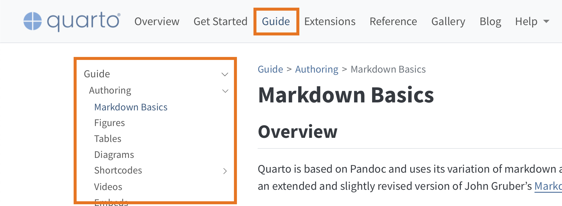
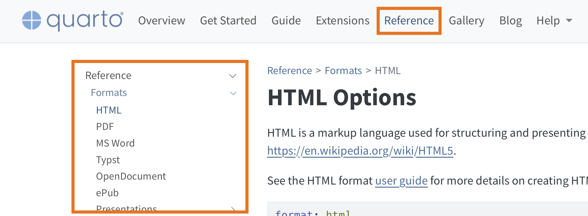
You find website-level options in Projects > Websites.
You find page-level options (that could be set site-wide in
_quarto.yml) in Formats > HTML.